
The 10-Slide Pitch Deck Formula
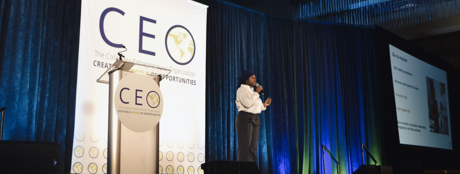
| 10 Slides Total |
<3 min Avg. Investor Read Time |
1 Idea Per Slide |
$100M+ Raised Using This Framework |
The Structure Judges and Investors Expect
Most pitch decks fail because they skip slides or bury the lead. This is the order that works — each slide earns the audience's attention for the next one.
|
|
||||
|
|
||||
|
|
||||
|
|
||||
|
|
3 Rules for Slides That Actually Get Read
CEO's pitch deck design guidance comes down to three principles. Every font choice, every layout decision and every diagram should pass all three.
LegibilityLarge, bold fonts with high contrast. Readable from the back of a room, key text at the top. |
SimplicityOne idea per slide, no exceptions. No excess text, logos or diagrams cluttering the point. |
ObviousnessTest it on a stranger. If they can't get it in seconds, simplify until they can. |
Why This Matters More Than Founders Think
Speed of ReadMost investors and judges decide whether to keep reading within the first 3 slides. If the problem isn't obvious by slide 2, the rest rarely gets a fair shot. That means your title slide and problem slide carry more weight than the other eight combined. Founders spend weeks on financial projections and minutes on their opening — and it shows. |
Memory Over DetailInvestors see hundreds of decks a year. The one they remember wins the follow-up call — not the one with the most data points. A simple story with one clear throughline sticks. A dense slide with six bullet points and a footnote does not. If a judge can't summarize your deck to a colleague in one sentence after seeing it, you've given them too much. |
Design Signals DisciplineA cluttered deck quietly tells investors how the founder will run the company. Misaligned text, inconsistent fonts and walls of copy suggest a founder who hasn't edited their thinking. Clarity on the slide reads as clarity in the business. The best decks look effortless because someone spent the time to strip them down to what matters. |
Mistakes That Kill Decks Before Slide 5
Your goal isn't to impress investors with data. It's to make your story impossible to forget. Every slide that doesn't earn its place weakens the ones that do.

Put This to Work at CEO
CEO members have multiple opportunities each year to pitch. Here's where this formula applies directly.
Global ConferenceThe 3-Minute Pitch and National Elevator Pitch competitions at the annual CEO Global Conference. Build your deck with this formula and compete against chapters nationwide. |
Regional ConferencesBUNEEC, Créateur, MWEC, SESI, HBCU E-Week and Values and Ventures all run pitch competitions. A clean deck makes the difference between placing and watching. |
Funding RequestsNeed money for a chapter event or conference travel? Pitch it like a business! |
Pre-Pitch Checklist
Run through this before you submit or present. If you can't check every box, your deck isn't ready.
|
|
Build Your Deck with CEO Member Tools
|
|
The best pitch decks don't win on volume. They win on clarity.
Ten slides, three design rules, one story investors can repeat back to their partners. Start building yours today.